


This is my rebrand concept for Bagel Bites that was made for Rebranding class.
This is the process book for creating the conceptual rebrand.
Throughout the book is a recap of all the aspects that went into this project.
Throughout the rebrand is a theme of circles progressively getting bigger as if radiating through the warm color palette. This is a nod to BB’s traditional packaging trying to emulate explosive taste from pictures of their bites being flown at the one looking at the box.
BB is known for its trademark traditional design. When it came to the initial thoughts on approach I knew I had to keep it as friendly and visually welcoming as possible while also keeping it fun for everyone, not just kids.
After much experimentation, the logo went a long way and ended up being derived from circles to make a bagel shape and use the hole as negative white space to simulate a BB with a bite, technically a “bagel bite” in its own right.
In it’s final form a repeated “bagel bite” creates the signature B form that takes over the rebrand and incorporates a ripple that can be attached to the ripple theme of the brand like on this spread.
The color palette focuses on an array of warm colors to signify the warmth and heat that these frozen bites need. The yellow is the most used color throughout the rebrand.
The main typeface should be curvy to some degree in order to follow the curves of the logo and the ripple effect of the circles. The secondary typeface had to be the opposite with structurally solid edges to show the structured side of BB while easily telling the difference between headers and the copy.
(Go to bottom of page in order to see pictures featured closer.)
As part of the collateral needed I mocked up a BB oven mitt where the grip side has the ripples to go along with the radiation of heat coming from the oven when you pick up the bites.
These in theory are supposed to be like heat lily pads that lead you on a game of Hot and Cold towards where the BB’s are. Down that aisle is a full length ripple vinyl that leads to the bites and tells you you’re getting warmer as you walk down until you reach them.
(Go to bottom of page in order to see pictures featured closer.)
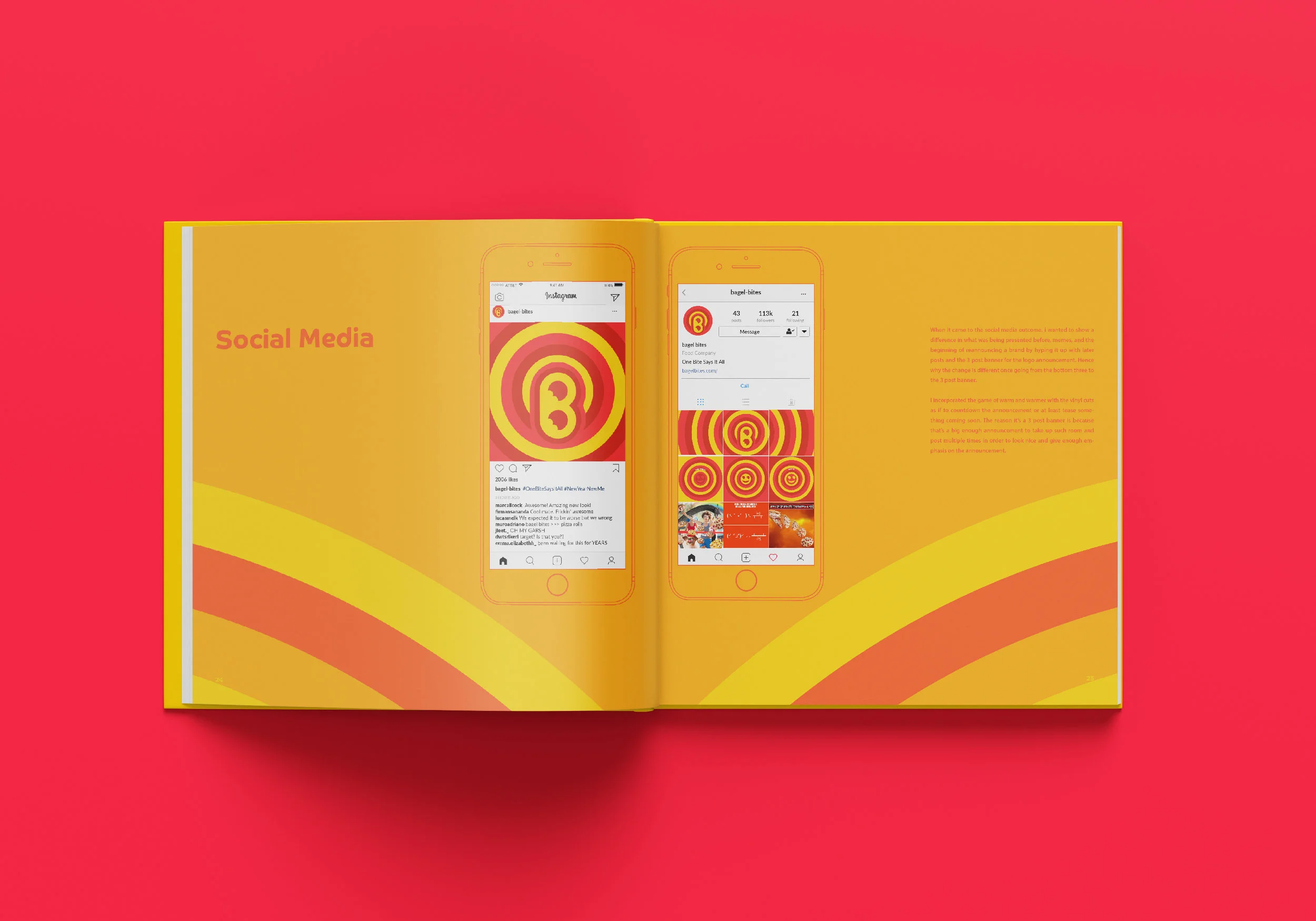
A glimpse into the BB instagram and its transforming from memes to something taken more serious for it’s debut.
“One Bite Says It All'“ with a smiley with bites for eyes!
If you look at the edges it shows marks for perforated slits to rip the box open.
These slits wrap around 3/4 of the box edges and are meant to separate the top and bottom of the box.
In theory the bottom of the box is a built-in heat retractive tray to heat up the bites if used for the microwave. This eliminates using more cardboard for a separate tray and the plastic bag won’t be needed anymore as it once was.
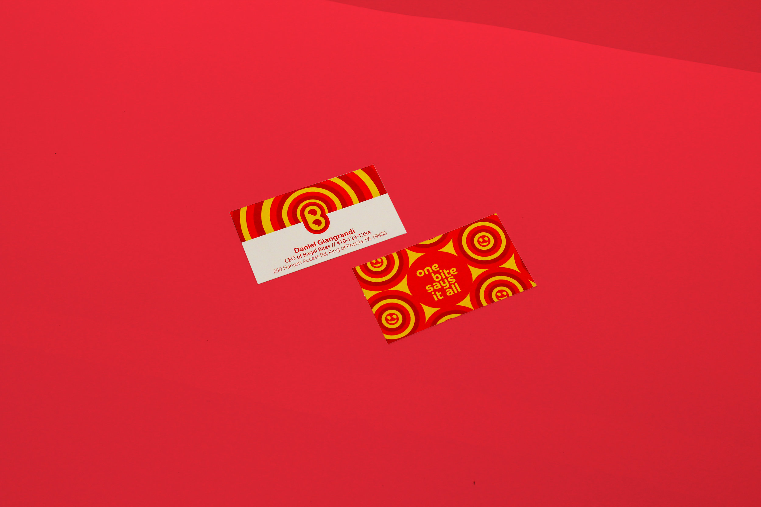
Who says stationary can’t be fun?